Better Research Insighs
Discovery
Product Strategy
Product Design
Overview
Propellerfish had spent the better part of 5 years developing an AI-powered research and insights platform — a tool designed to give their clients a faster, smarter way to gather and analyse consumer research. The concept was strong. But as AI began reshaping the consulting industry, the pressure to accelerate became urgent.
The Challenge
The platform existed, but it was mainly used internally and was badly designed. The learning curve was steep, and users reported higher than average time lost to error handling. The mobile app — the consumer-facing interface used to capture participant responses to research questions — had also been built entirely by developers without any design input. The result was a technically functional but commercially unviable product:
With a major client evaluating the platform, the Propellerfish needed to move from rough prototype to launch-ready product — fast.
(Existing platform audit)
(Existing platform audit)
Discovery Insights
During discovery I worked directly with the CEO, CTO, and lead developer, I led the strategy through a series of interviews with the target users to understand how they were using the platform and to identify key design problems, constraints, and user needs. The goal was not just to improve the interface — it was to define the strategic vision and requirements for the product that would lead to a foundation for scalable, fast-moving development going forward.
Design problems & contsraints:
- No brand identity or visual consistency — the app looked unfinished and inspired little confidence in research participants.
- No design system or component library — every screen had been built in isolation, making development slow and future scaling costly.
- Poor wayfinding and error handling — users were getting lost within the app, unable to recover from mistakes or understand where they were in a research session.
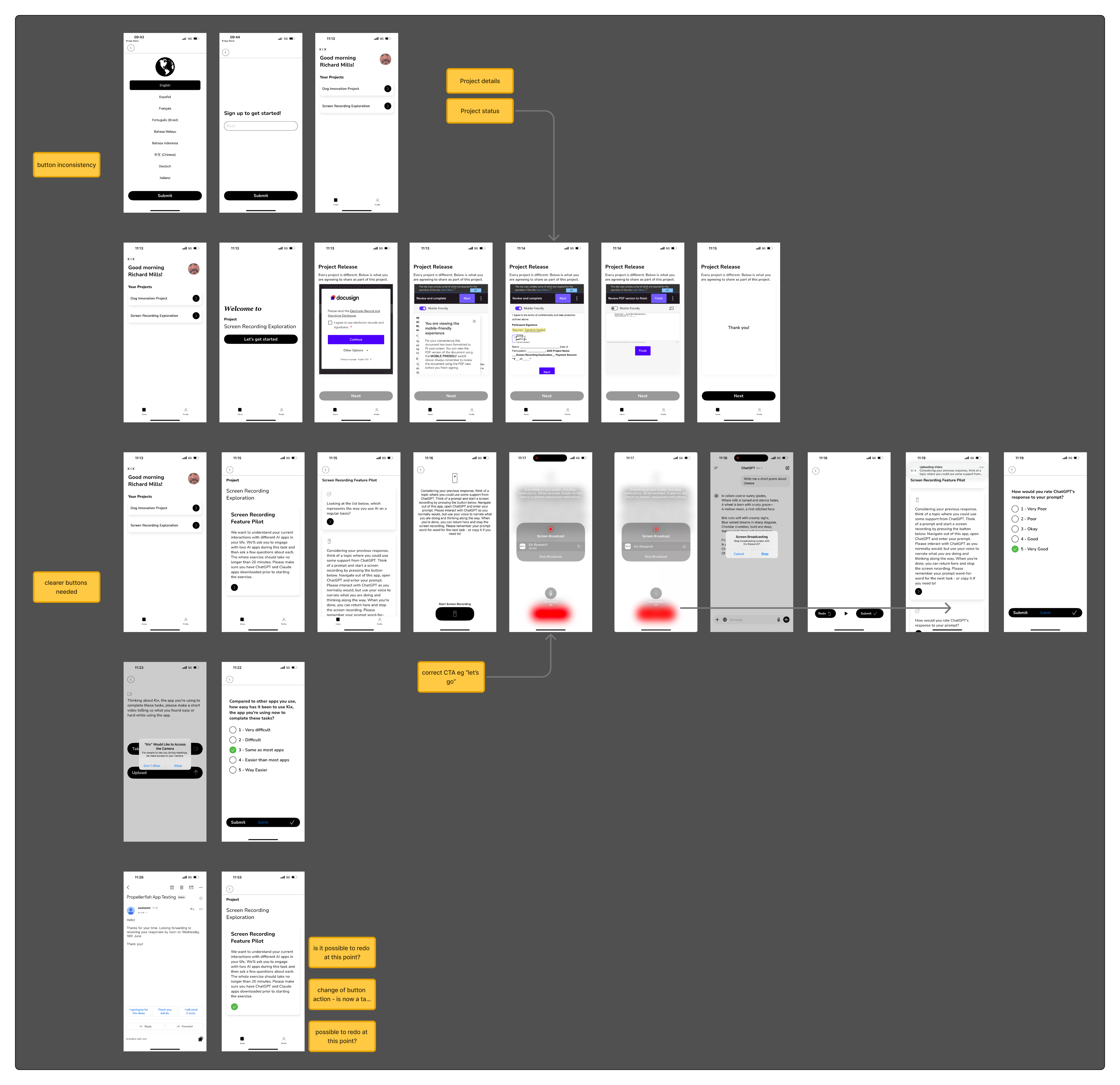
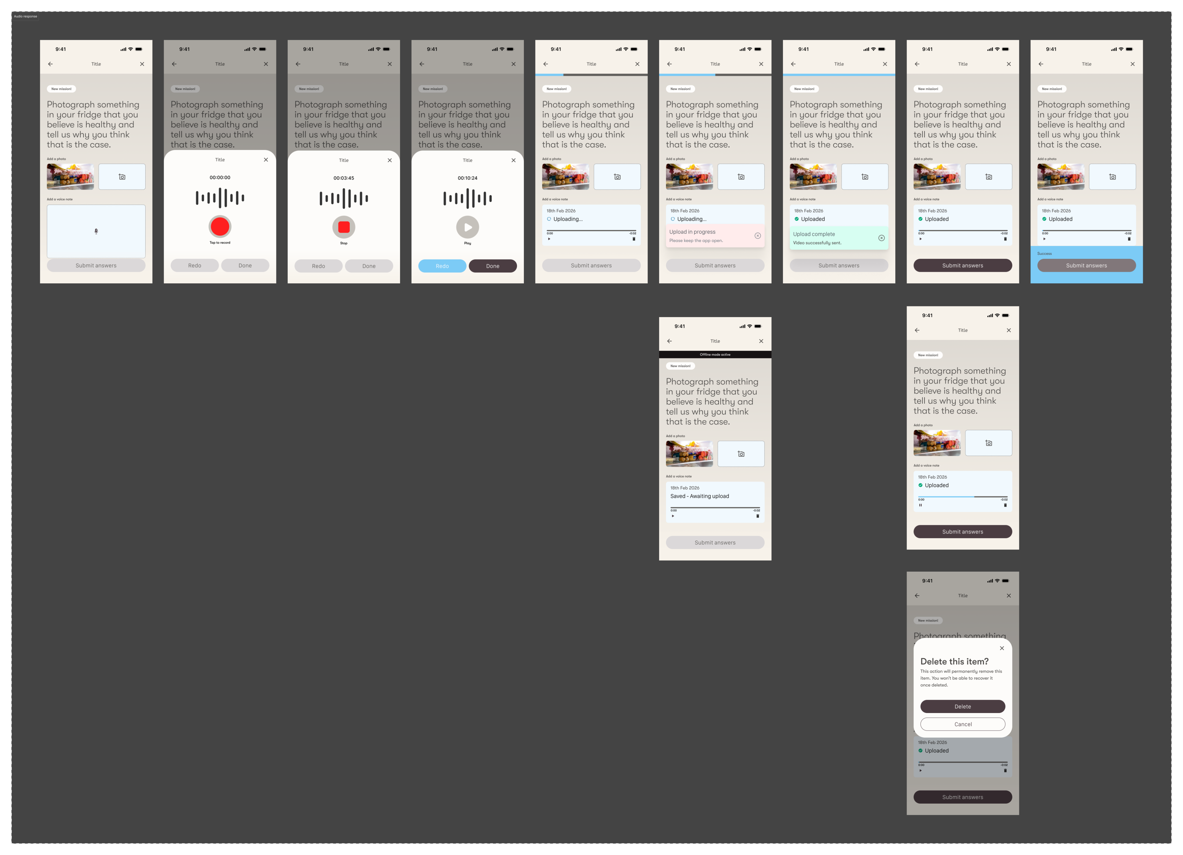
- Unreliable system status feedback — critically, participants were losing recorded video responses because the app gave no clear indication that uploads were still in progress, causing them to exit before submission completed.
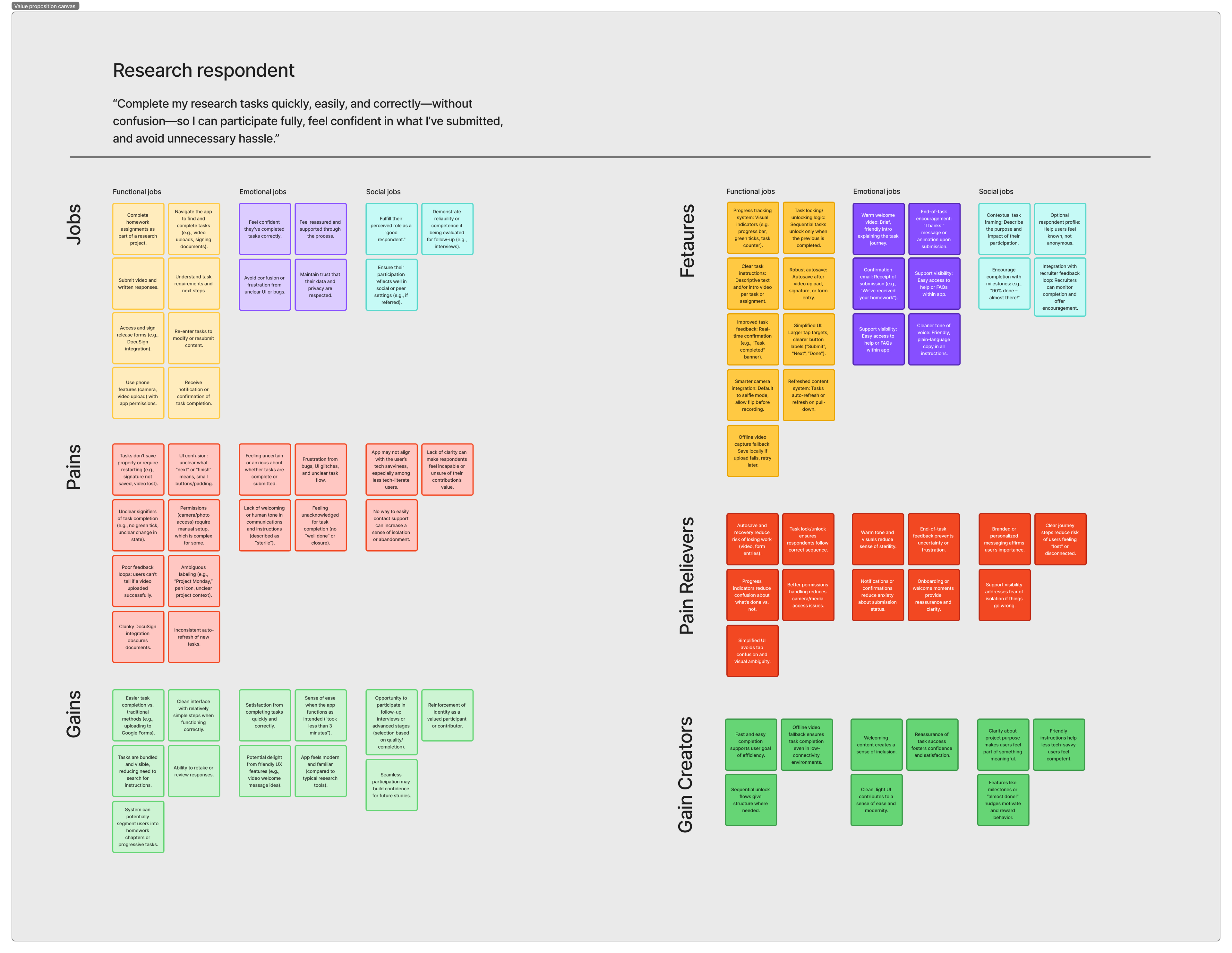
(JTBD)
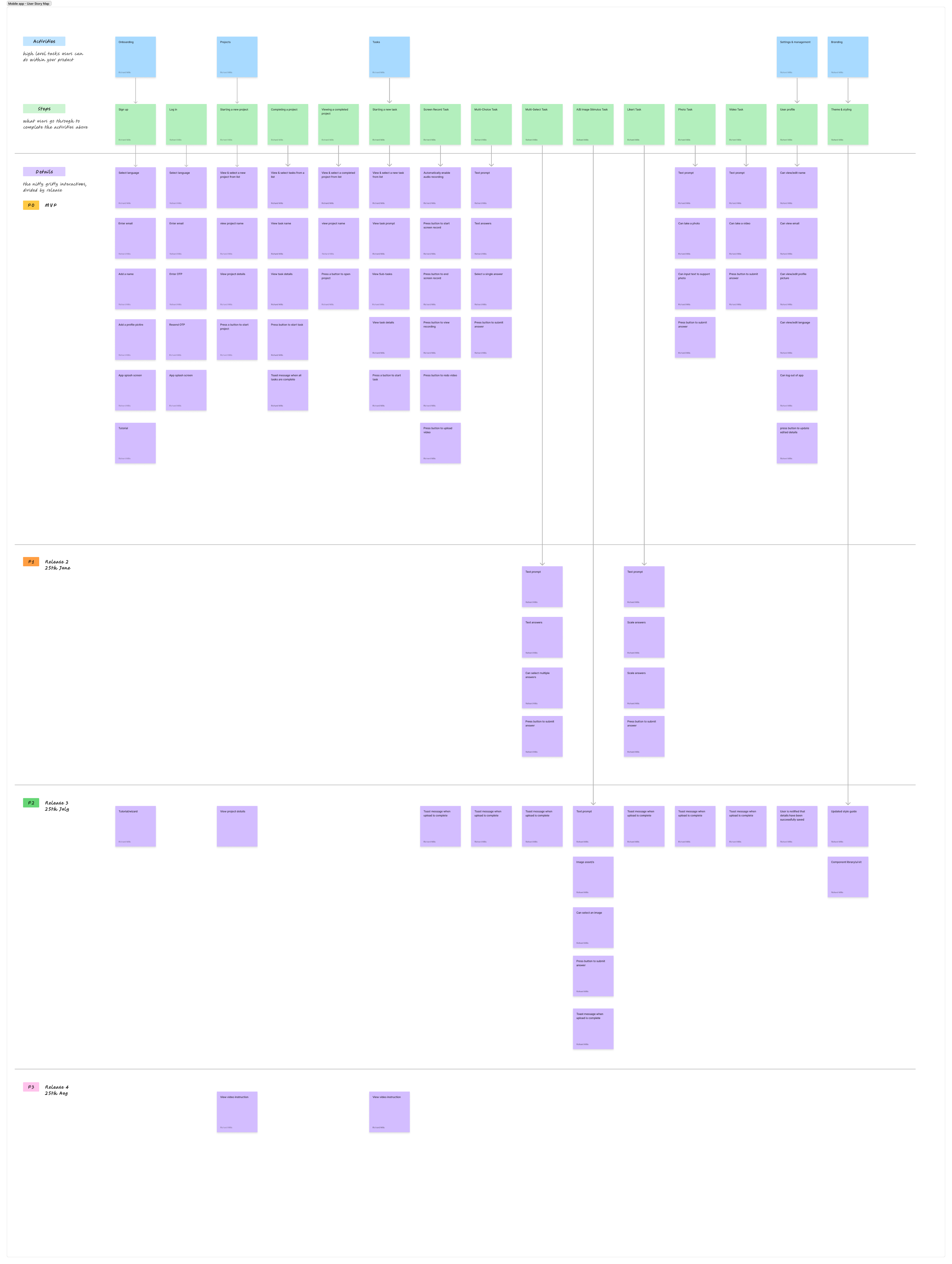
(Storymap)
Design & Prioritisation
I took a ground-up approach to user research and audience segmentation. I interviewed real Sportsnet users, sent surveys, and engaged in online communities to understand the needs, attitudes and behaviours of Canadian sports fans and how they consumed their favourite sports online. Using the insight I was able to establish their core functional, social and emotional needs
But the goal was never just functional. In a market where AI research tools were multiplying fast — most of them visually interchangeable, template-driven, and forgettable — the product needed to feel like it belonged to this consultancy specifically. That meant a design that was considered, distinctive, and impossible to mistake for a white-label alternative.
Key design solutions included:
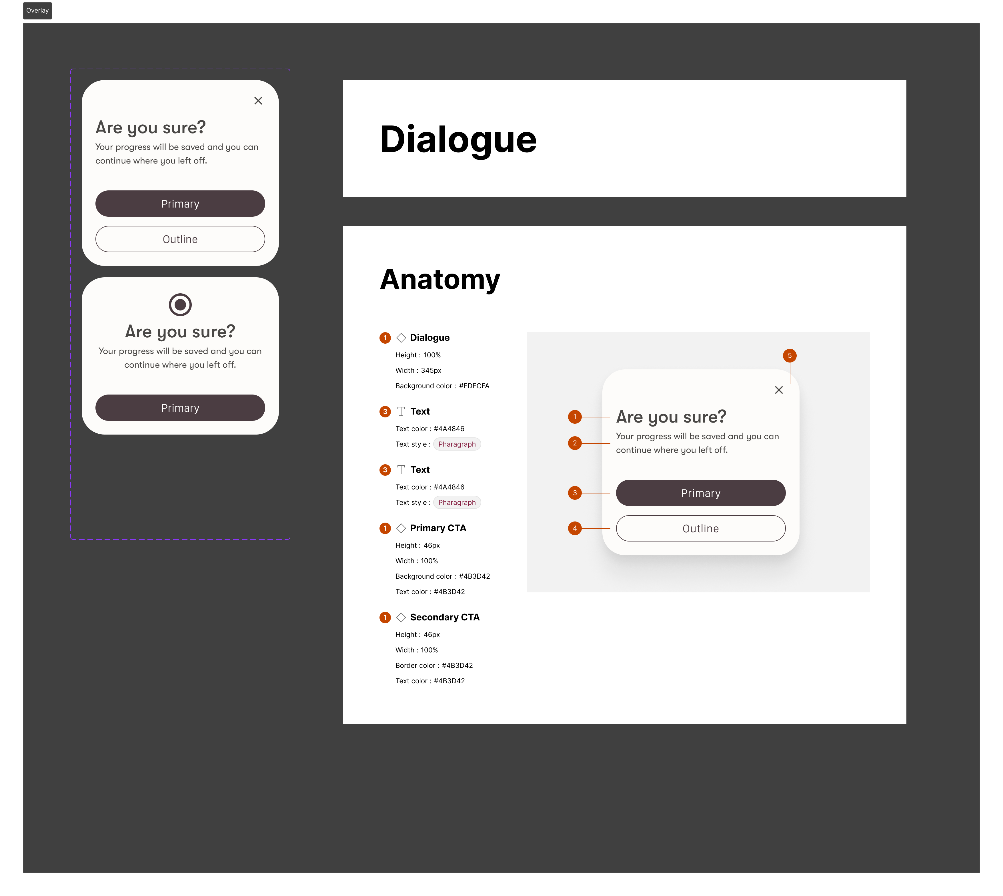
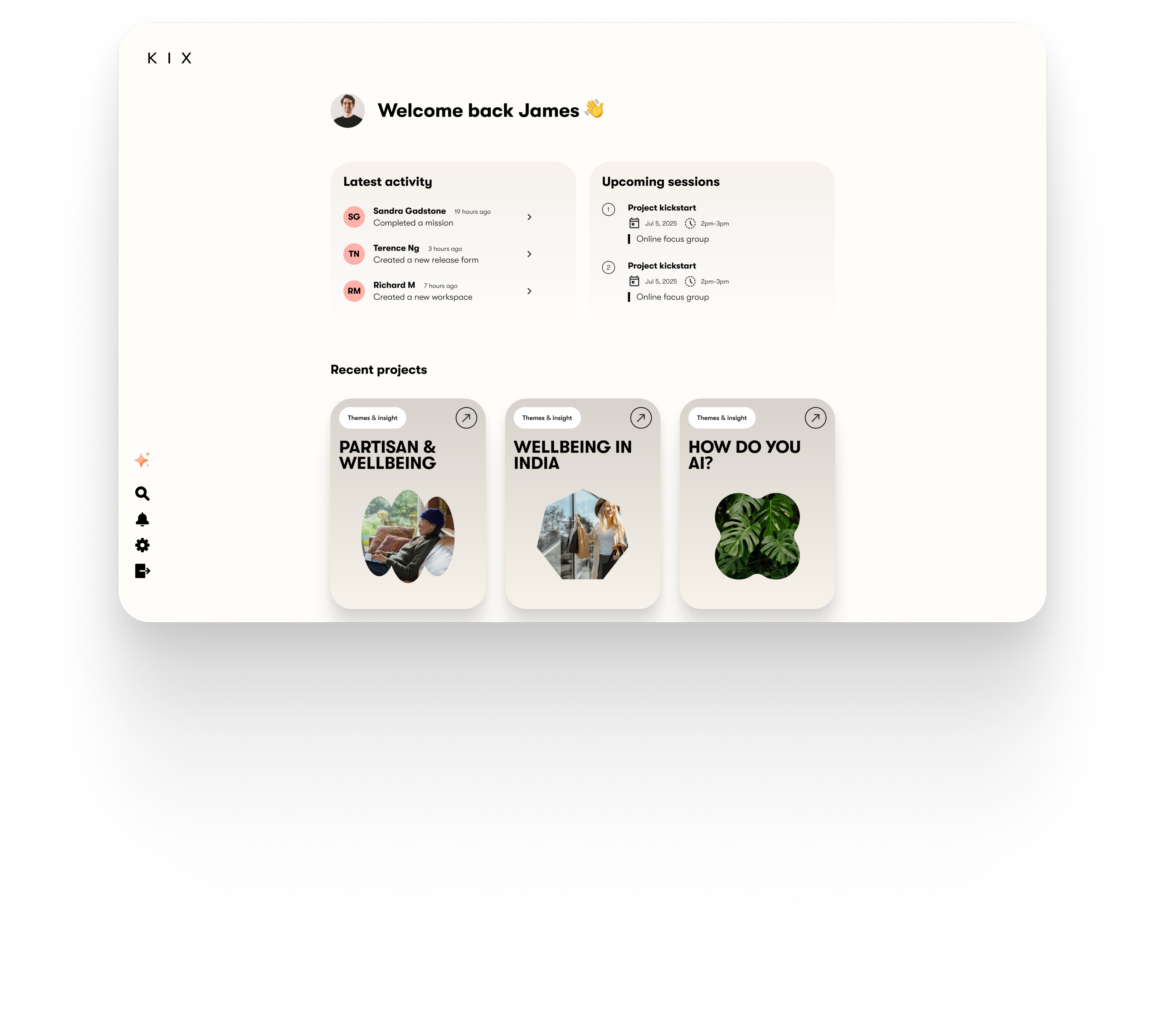
- A unified component library and design system — built not just for consistency and development speed, but as a deliberate expression of the consultancy's brand. Every visual decision, from typography to colour to spacing, was made to reinforce credibility and signal quality to research participants from the first screen.
- Redesigned navigation and wayfinding — users could now orient themselves clearly within the app, understand their progress through a research session, and recover from errors without losing their place. The experience felt considered rather than assembled.
- Robust system status and upload feedback — a redesigned progress and status layer ensured participants always knew when uploads were in progress, preventing the video response losses that had plagued the previous version.
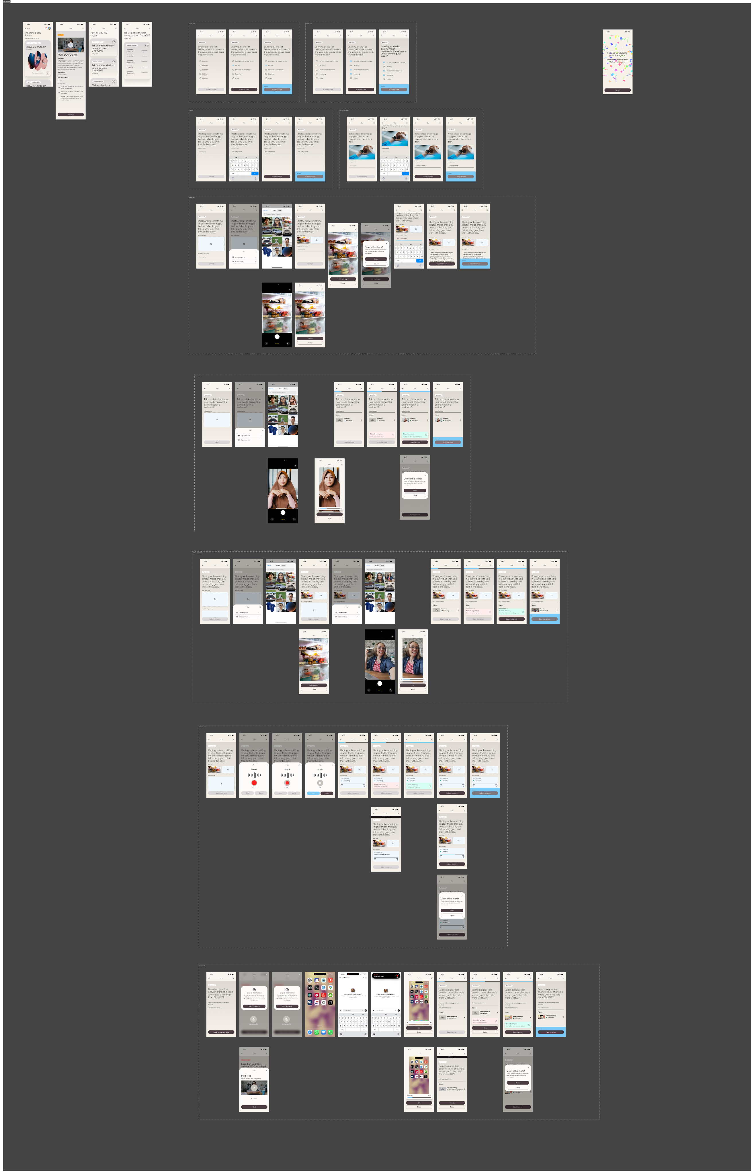
- A custom multi-file screen recording submission flow — designed from the ground up to handle multiple screen-recorded video files in a single submission. No native mobile functionality existed to solve this. No off-the-shelf pattern came close. It required genuine design-led problem solving — and the result showed.
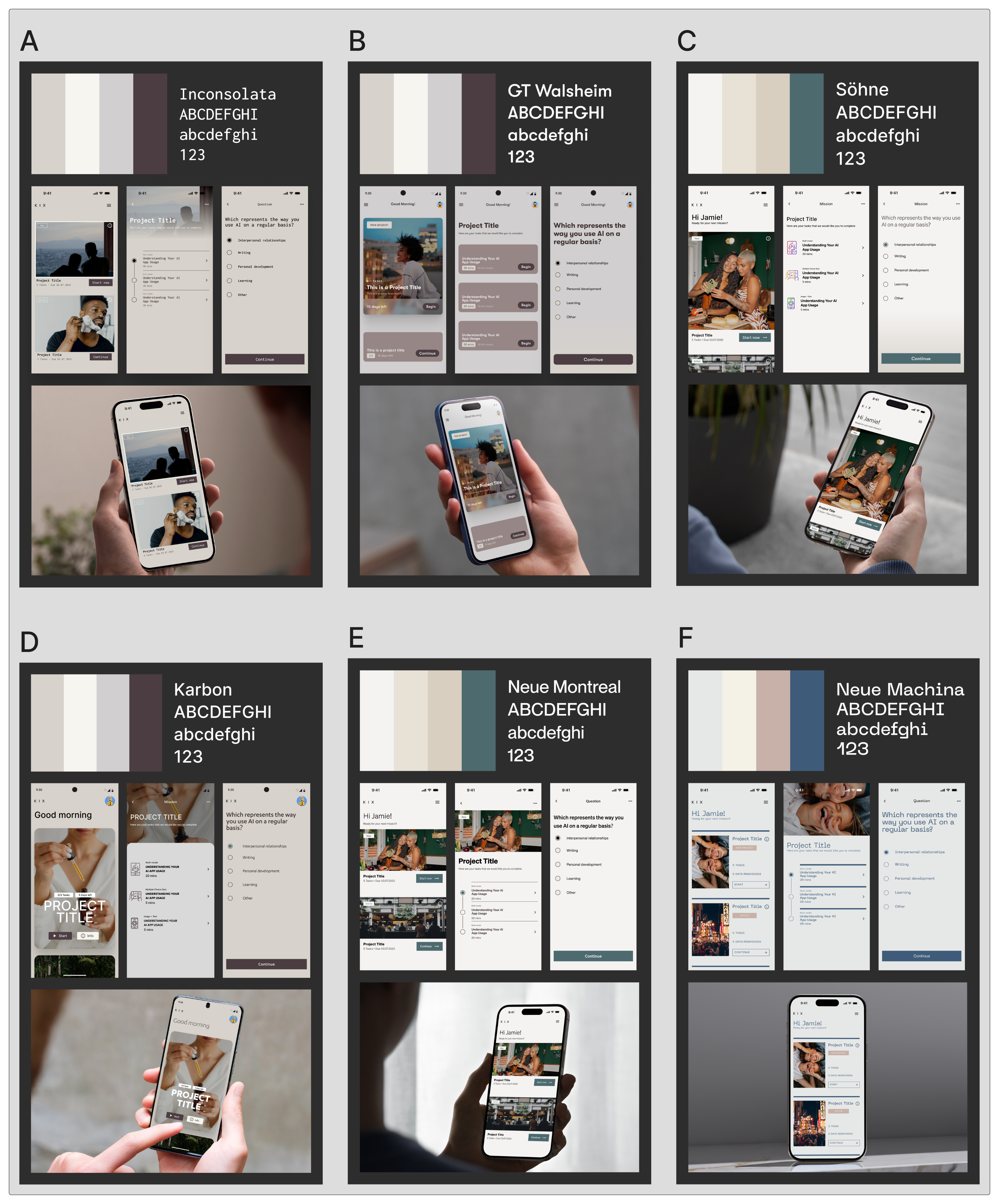
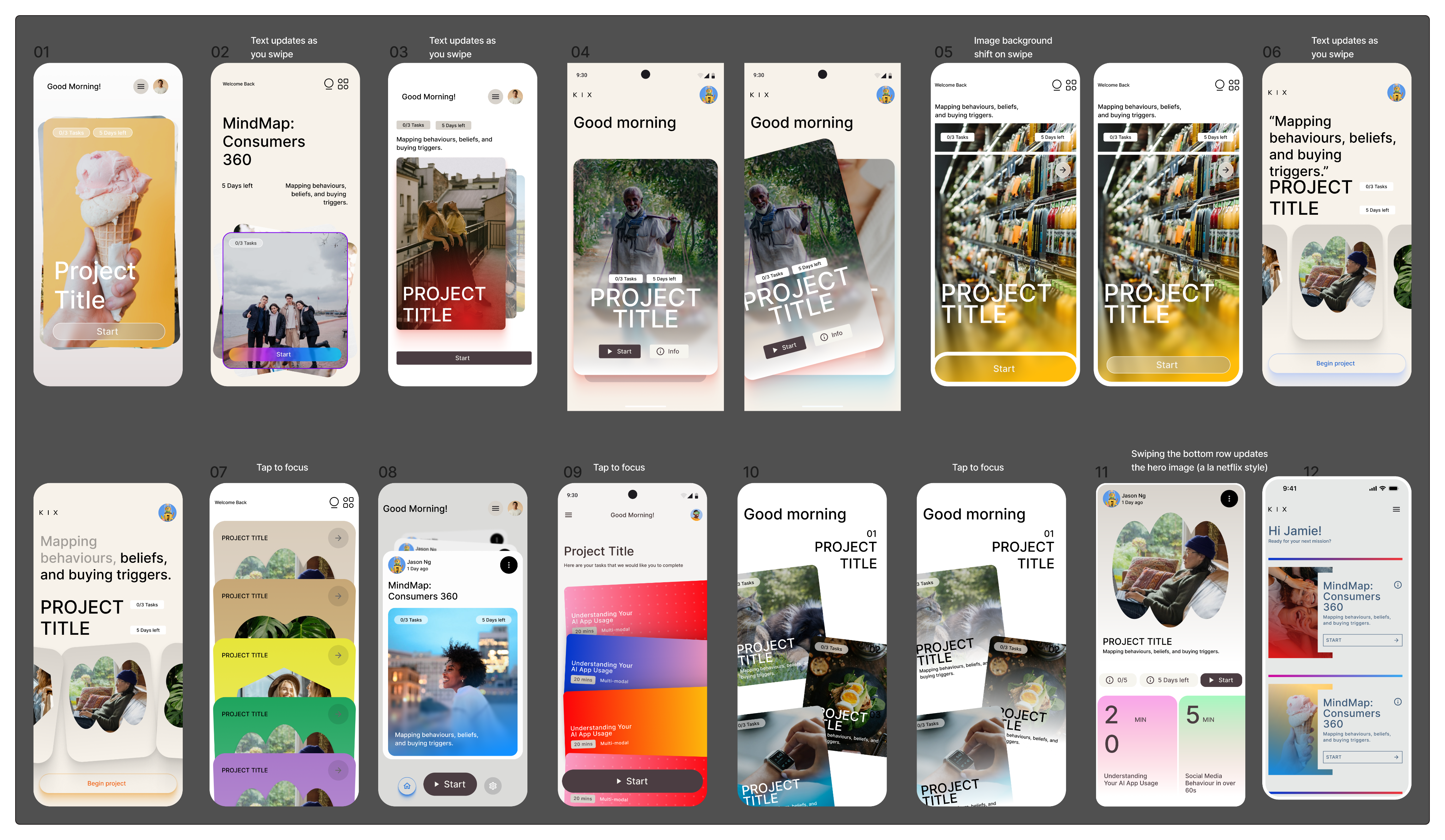
(UI styling concepts)
Outcomes & Impact
The final product was tangible evidence of the consultancy's ability to execute on its AI-powered vision with the quality and clarity of consumer grade product.
More concretely, the initial enterprise customer committed to using the platform for the foreseeable future — a direct commercial validation of the product's readiness and the value of getting the user experience right before scaling. New customers have already started to be onboarded as well, further increasing the commercial opportunity of the initiative.
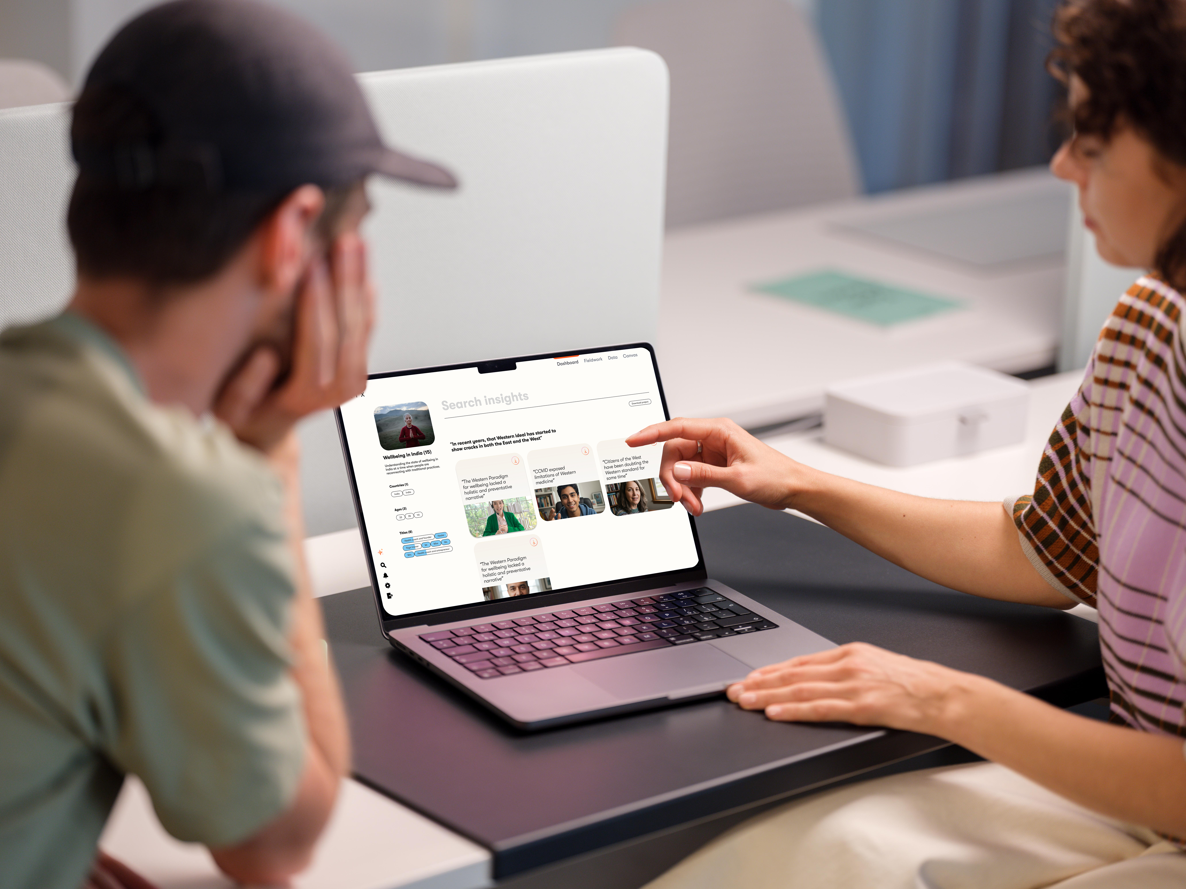
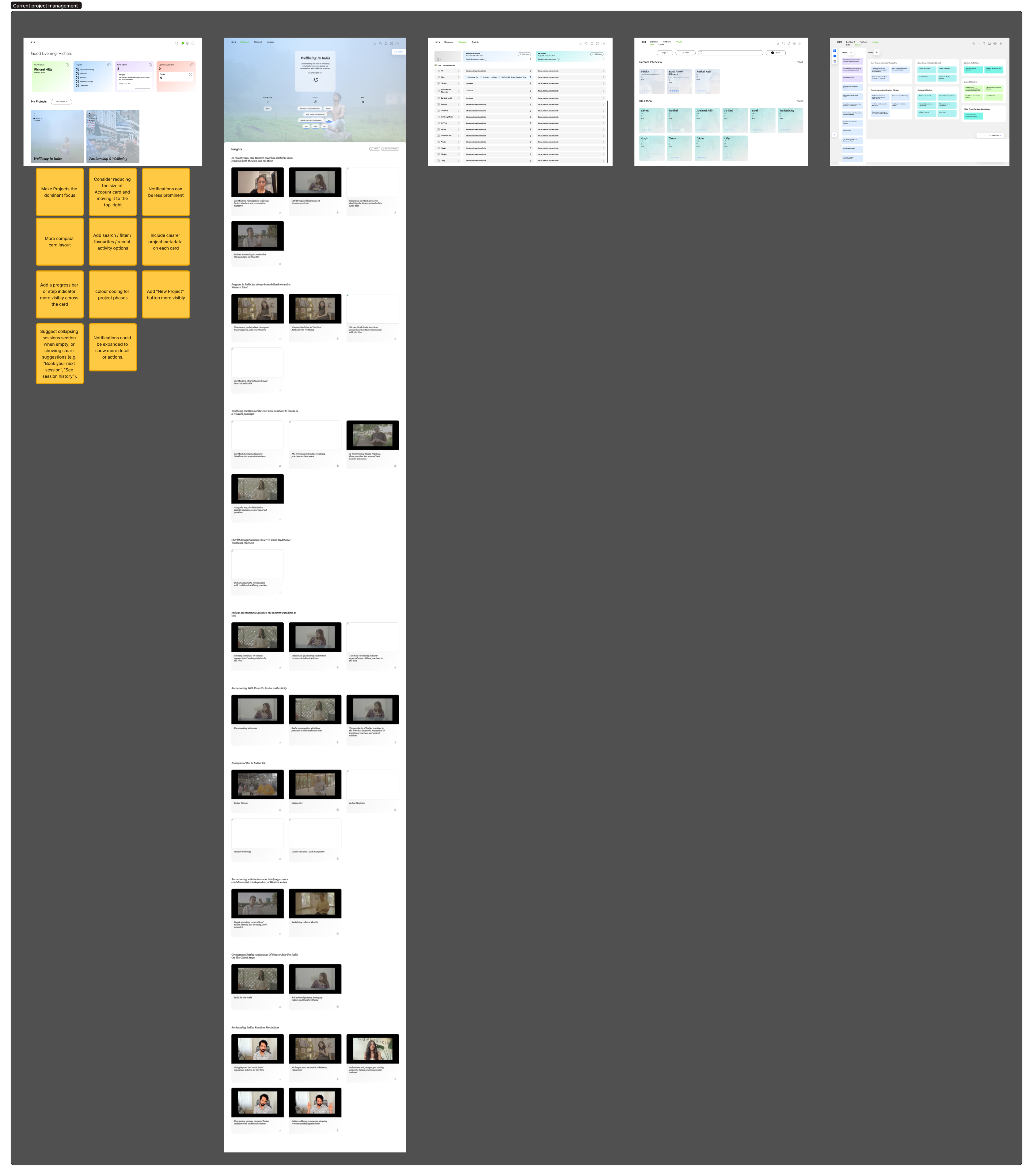
(Desktop app)
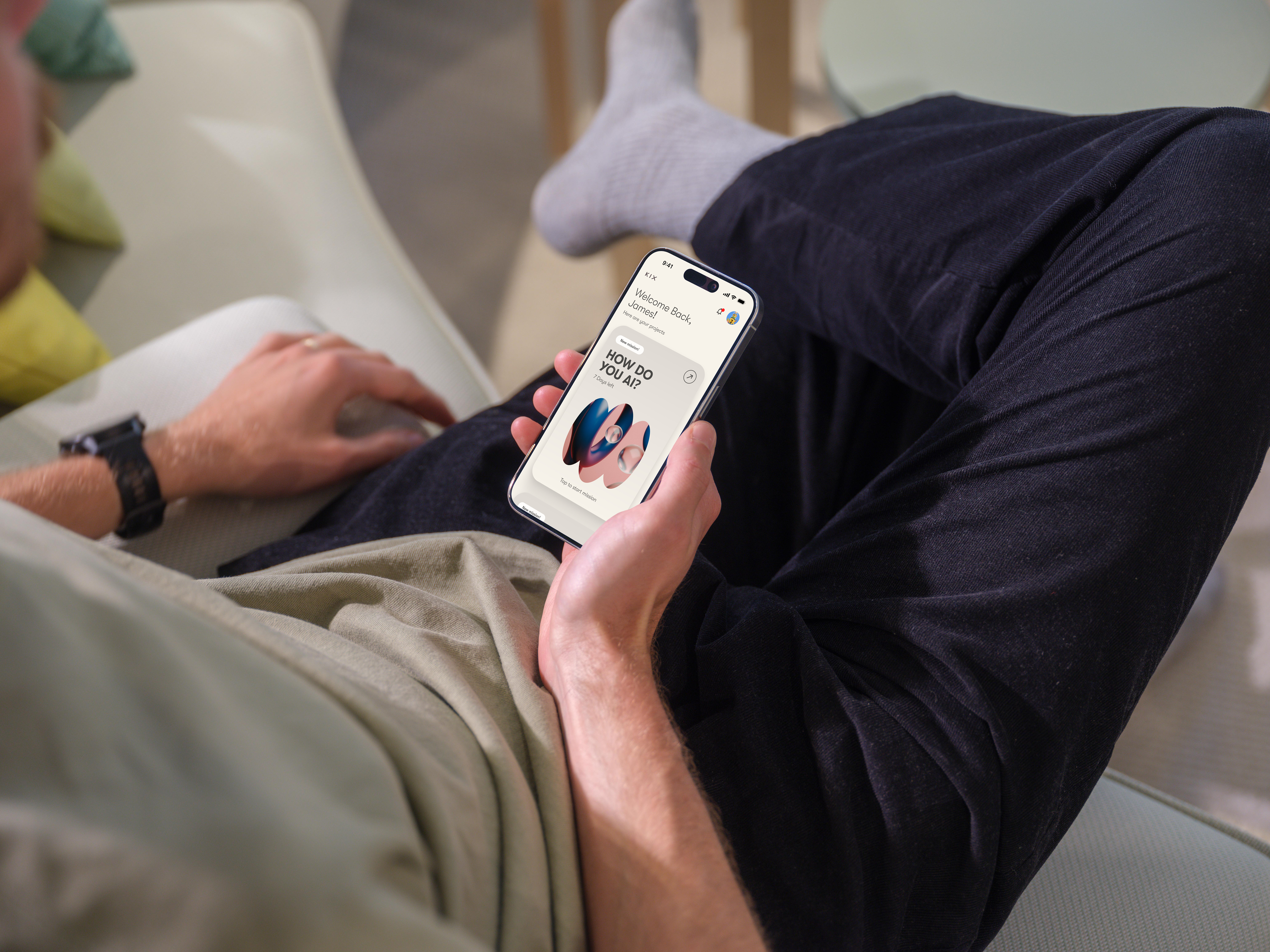
(Mobile app)
(Design system)
(Design system)